先日、scikit-learnの新しいバージョンがリリースされていたことに気づきました。
Version 0.22.0 December 3 2019
色々、機能が追加されていたり、改善が施されていたりしますが、何かパッと試せるものを試してみようと眺めてみたのですが、
新機能の中に metrics.plot_confusion_matrix というのが目についたのでこれをやってみることにしました。
元々、 confusion_matrix を計算する関数はあるのですが、
出力がそっけないarray で、自分でlabelを設定したりしていたのでこれは便利そうです。
まず、元々存在する confusion_matrix で混同行列を出力してみます。
from sklearn.svm import SVC
from sklearn.datasets import load_iris
from sklearn.model_selection import train_test_split
from sklearn.metrics import confusion_matrix

# データの読み込み
iris = load_iris()
X = iris.data
y = iris.target
class_names = iris.target_names

X_train, X_test, y_train, y_test = train_test_split(
                                        X,
                                        y,
                                        test_size=0.2,
                                        random_state=0,
                                        stratify=y,
                                    )

# モデルの作成と学習
classifier = SVC(kernel='linear', C=0.01).fit(X_train, y_train)
y_pred = classifier.predict(X_test)
print(confusion_matrix(y_test, y_pred))

"""
[[10  0  0]
 [ 0 10  0]
 [ 0  3  7]]
"""
最後の行列が出力された混同行列です。各行が正解のラベル、各列が予測したラベルに対応し、
例えば一番下の行の中央の3は、正解ラベルが2なのに、1と予測してしまったデータが3件あることを意味します。
(とても便利なのですが、行と列のどちらがどっちだったのかすぐ忘れるのが嫌でした。)
さて、次に sklearn.metrics.plot_confusion_matrix を使ってみます。
どうやら、confusion_matrixのように、正解ラベルと予測ラベルを渡すのではなく、
モデルと、データと、正解ラベルを引数に渡すようです。
こちらにサンプルコードもあるので、参考にしながらやってみます。
normalizeに4種類の設定を渡せるのでそれぞれ試しました。
データとモデルは上のコードのものをそのまま使います。
import numpy as np
import matplotlib.pyplot as plt
from sklearn.metrics import plot_confusion_matrix

# 表示桁数の設定
np.set_printoptions(precision=2)

# 可視化時のタイトルと、正規化の指定
titles_options = [
        ("Confusion matrix, without normalization", None),
        ("Normalized confusion matrix: true", 'true'),
        ("Normalized confusion matrix: pred", 'pred'),
        ("Normalized confusion matrix: all", 'all'),
    ]

fig = plt.figure(figsize=(10, 10), facecolor="w")
fig.subplots_adjust(hspace=0.2, wspace=0.4)
i = 0
for title, normalize in titles_options:
    i += 1
    ax = fig.add_subplot(2, 2, i)
    disp = plot_confusion_matrix(
                        classifier,
                        X_test,
                        y_test,
                        display_labels=class_names,
                        cmap=plt.cm.Blues,
                        normalize=normalize,
                        ax=ax,
                    )

    # 画像にタイトルを表示する。
    disp.ax_.set_title(title)

    print(title)
    print(disp.confusion_matrix)
plt.show()

"""
Confusion matrix, without normalization
[[10  0  0]
 [ 0 10  0]
 [ 0  3  7]]
Normalized confusion matrix: true
[[1.  0.  0. ]
 [0.  1.  0. ]
 [0.  0.3 0.7]]
Normalized confusion matrix: pred
[[1.   0.   0.  ]
 [0.   0.77 0.  ]
 [0.   0.23 1.  ]]
Normalized confusion matrix: all
[[0.33 0.   0.  ]
 [0.   0.33 0.  ]
 [0.   0.1  0.23]]
"""
最後に表示された画像がこちら。
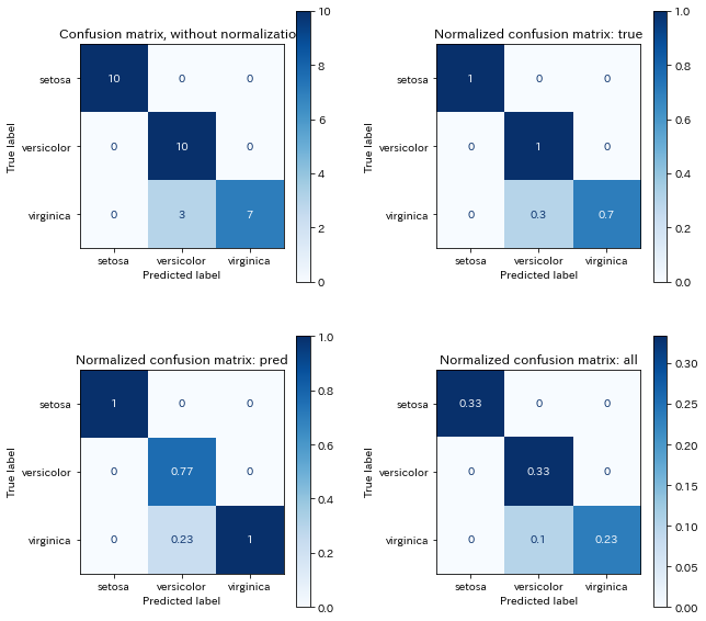
今回例なので4つ並べましたが、一つだけ表示する方が カラーバーの割合がいい感じにフィットします。
軸に True label、 Predicated label の表記を自動的につけてくれるのありがたいです。