matplotlibで3次元のグラフを作成する方法のメモです。
今回は散布図を描いてみます。
matplotlibで3次元のグラフを書くには、mplot3d Toolkitというのを使います。
ドキュメント: The mplot3d Toolkit
また、 3次元散布図についてはこちらのドキュメントも参考になります。 3D scatterplot
ポイントとしては、(importした後明示的には使わないので忘れがちですが、)
Axes3Dを必ずインポートしておくことと、axを取得するときに、
projection="3d"を忘れないことですね。
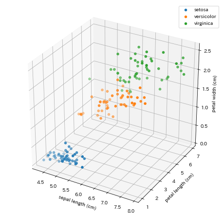
iris のデータの4つの特徴量の中から適当に3個選んでやってみます。
import matplotlib.pyplot as plt
from mpl_toolkits.mplot3d import Axes3D
from sklearn.datasets import load_iris

iris = load_iris()
data = iris.data
label = iris.target

fig = plt.figure(figsize=(8, 8), facecolor="w")
ax = fig.add_subplot(111, projection="3d")
for c in range(3):
    ax.scatter(
        data[label == c, 0],
        data[label == c, 2],
        data[label == c, 3],
        label=iris.target_names[c]
    )

ax.set_xlabel(iris.feature_names[0])
ax.set_ylabel(iris.feature_names[2])
ax.set_zlabel(iris.feature_names[3])

ax.legend()
plt.show()
結果がこちら。
綺麗に3次元のプロットができました。